Tuesday, November 24, 2015

Happy Thanksgiving 2015

It seems like the perfect time to look back and thank everyone for their excitement, enthusiasm, and support over the last two years as we've worked on American Rehab Charleston and The TV House.  All the calls, notes, posts, and visits have meant a lot to us as we navigated unfamiliar waters.  We're still working day-by-day to finish the projects on this property as we simultaneously get acclimated to our new surroundings and help the kids adjust to their new home, new schools, and all the other changes they're experiencing.  It's been an eventful time for us and we're excited about what's next after the holidays.

Happy Movember
I'm always keeping my eyes open for future projects.  As I've said before, finding the right property seems like the most challenging part of what I do (see What's the most difficult part...).  My history of renovating these run down homes (pig's ears) has put me in deals directly with homeowners more often than working though Real Estate agents.  This is no reflection on RE Agents as much as it's more of an indication that the properties I've taken on have been so bad, that realtors didn't want to represent them.  And who could blame them for not wanting to be connected with a property that's been condemned, left vacant, or seemingly abandoned.  So when I see a house that's vacant and over grown or For Sale By Owner, those places peak my interest as much or more as the extremely run down houses that are actively being marketed on the MLS (Multiple Listing Service) with the label As Is

Finally, thanks to all of you who have asked about the possibility of me doing future television work.  I really enjoyed the experience and would love to do it again if we can find the right property and hook up with the right people to do it.  Of course, as I've just learned, timing is also important in a project documented for television so that will factor in as well.  In the mean time, I have projects I still need to finish or see through and will continue to document this work on BSAPE.

Happy Thanksgiving,

Trent
bloodsweatandpigsears@hotmail.com

Friday, September 25, 2015

Paint Colors for The TV House

 
On a typical Pig's Ear, I have a solid understanding from the start that I will eventually be a seller looking for a buyer.  Neutral paint colors are the practical way to go.  Taupe on the walls and trim/doors/cabinets painted polar white.  These are my go to colors.  With this approach, I don't have to hope my color choices are appreciated by potential buyers, plus it's more economical to go neutral.  Multiple colors is more challenging for the painter and that makes the price go up.  Plus there's always paint left over which is more wasted dollars.  Keeping things uncomplicated when I can helps the schedule and the budget and it's not hard to keep things simple with paint.  In addition, going neutral makes it easier to sell in the end and that helps the bottom line as well.  Even when I've lived in the house for a few months or a few years, I've gone neutral for all the above reasons.     

The TV House was special and I held no reservations about adjusting my approach.  I wanted this Country Victorian to look sharp on camera and understood that the producers would know best how to make this happen.  They asked me my thoughts on the paint selections and my input was simple, "Whatever makes it look good on TV."  Once filming started, I was even more satisfied that I let them choose the colors because things look different on camera and some of the same colors appear more or less intense with alternate cameras and adjustments to the lighting. 

I'd love to take credit for the paint choices that people are so impressed with, but I won't.  I will take credit for letting a talented team do what they know so much better than me.  I did know to stay out of the way in this area.  They were sure to include me in the process by showing me the selections for each room and episode, but my input was minimal.  Most of the time I looked at what they'd come up with and was excited about the combinations. 

Some have reached out and asked me to share paint information.  I appreciate the interest.  With the internet, it will be easy to take the color names/numbers provided below and get the exact paint we used on the show.            

   Exterior
      Siding - Butter Up, SW6681
      Front Porch Doors - Brick Paver, SW7599
      Lattice, Shutters, & Wrought Iron Handrail - Charleston Green, DCR099

   Interior
      Living Room - Sand Beach, SW7529
      Living Room Ceiling - Honest Blue, 6520
      Office Wainscoting - Surf Green, SW6473
      Bedroom - Surprise Amber, SW6654
      Bathroom - Manitou Blue, SW6501
      Master Bedroom - Kind Green, SW6457
      Master Bath - Totally Tan, SW6115
      Interior Trim/Doors - Alabaster, SW7008

Enjoy!

Trent
bloodsweatandpigsears@hotmail.com

Taupe and Polar White in The Fire House
... and The Cottage
... The Hurricane House
... The Bungalow

Sunday, September 20, 2015

American Rehab Day on DIY

Wednesday, Sept. 23rd
DIY Network
9am - Midnight EST

The DIY Network will air all four ARs this Wednesday from 9am until midnight with a brief Rehab Addict intermission from 8-9pm.   I've written about each series, homeowners, and houses already so I won't go into much detail again.   
 
The marathon starts at 9am with Chris and Amy Lee saving Chris' ancestral home in The Motor City.  I especially love the picture of the Lee Family with their detached garage (below).  Besides serving as the project manager/general contractor on this massive effort, Chris is also a car guy (see The Straights Garage).  So... it's no surprise that he wants to salvage what he has left of their outbuilding.  Just wait til you see what they do with the brick shell in the background of the pic.  Real estate folks say that kitchens and bathrooms sell houses.  Well, the right garage can really help too, especially for a man on the fence.    

American Rehab Detroit
9am - Noon

American Rehab Virginia is another family mission with Tayloe and Catherine Emery restoring the Tayloe  Clan's piece of history.  This is a Colonial Home and because it's on the National Register of Historic Places they had to consider historic integrity on multiple scopes of work in a way that the other three series have not.  This necessary wrinkle made their rehab even more challenging, but also more educational/informative for their audience. 

Noon - 5pm

Before this all started, I called our project The Country Victorian.  However, since we've been on DIY (and also HGTV) it's earned a new name: The TV House.
 
American Rehab Charleston  (Aug. 27, 2014)

5 - 8pm

I just wrote about how much I like Shalina Joy and the home she calls Victoria on Sept 14th, so I won't say a lot more here.  I'm excited to watch the last two episodes; the backyard makeover and the final show.  

American Rehab: Saving Victoria
9pm - Midnight


On Deck...


American Rehab Buffalo
with Jason Wilson and Bernice Radle
American Rehab Buffalo
Wed., Sept 30th
DIY Network
9 - 11pm EST

I'm really looking forward to seeing American Rehab Buffalo.  Bernice Radle and Jason Wilson are wild about Buffalo and from some pictures I've spotted on-line, it looks like they do some pretty cool stuff with the house they take on in their series.  I'm ready to learn more about The Queen City of The Great Lakes while Bernice and Jason get after it on their project house.

 
American Rehab Utah
with Andy and Candis Meredith 
I'm also ready for American Rehab Utah.  Did you know that the Beehive State is the 2nd fastest growing state in the U.S. behind North Dakota?  Anyway, someone once told me to be suspicious of anyone with two first names, but I have a good feeling about hosts Andy and Candis Meredith who run their own home renovation business while also raising seven children.  Wow!  That's enough to field a future Olympic Rugby Team!  I'll tell more about this series down the road. 
 
And finally, Limp Bizkit guitarist Wes Borland has announced that he'll host American Rehab: Motor City with Carre Calloway (Queen Kwong).  It looks to be a grand Roaring Twenties Era home.  Awesome!   
                                                                         
American Rehab: Motor City
with Wes Borland and Carre Calloway
  

Wednesday, September 16, 2015

American Rehab: Detroit

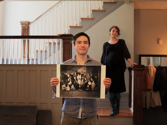
Chris holding The Photo.
Thurs., Sept 17th
8:30 - 11am
DIY Network


I was totally jammed up when American Rehab Detroit originally aired at the end of January because we were knee deep in the filming of our own project.  I watched/enjoyed the shows, but didn't squeeze in a post to tell why I liked ARD.
 
First off, Christopher Lee's story is an example of what I think might just be the best reason to renovate an extremely run down home:  a family connection to the property.  The home featured on the show that he now shares with his wife Amy, was built by/for his ancestors in the early Twentieth Century and ultimately they lost it in the Great Depression.  I think this story is timely since, as a nation, we just lived through the real estate turn down and the Great Recession.  In a way like never before, we can all better imagine how Chris' kin lost this house. 
 
Secondly, the picture shown above really get's me.  I don't want to overblow things and say, "This is what it's all about,"  but I see the significance and I look at it as a home renovator myself while I think, "That's a big moment right there."  He's holding the old photo of his family in the same spot in the house right about where the photographer was positioned.  He has a satisfied smile on his face with Amy proudly standing behind him.  Great pic.
 
Finally, without spoiling anything in the show, I want to share a third thing I love about American Rehab Detroit and the couple's story.  There's a moment in the intro, when Chris says, "I just thought, why not?"  He just made up his mind to take on this crazy mission and Amy came along for the ride.  I love what he says and the way he says it.  Robert F. Kennedy said, “There are those that look at things the way they are, and ask why? I dream of things that never were, and ask why not?”  There are plenty of people who look at an extremely run down property and say, why try to save it.  Chris looked at this ginormous challenge and with a casual shrug replied, "Why not?"     
 
Well done, Chris.  You did it, Man!


Monday, September 14, 2015

American Rehab: Restoring Victoria with Shalina Joy

Victoria
Wait til you see the inside.
Wed., Sept. 16th
10pm - Mid. EST
DIY Network

I'll stop short of telling you all to watch American Rehab: Restoring Victoria.  I'm only going to report that I watched it, loved it, and am excited to see the next two episodes this week.  Shalina Joy is the Newark, New Jersey homeowner and she affectionately calls her 6,000 sqft. rehab Victoria.  She speaks lovingly about her 'baby' as if the house is a dear member of her family... just one of the things that makes her series of American Rehab special from the start. 
 
Although the Mediterranean Revival-Style house is amazing, I think Shalina is the real star as she leads everyone through her renovation.  She's full of a palpable mixture of hope for what she might find and enthusiasm for what she can appreciate already with her own eyes.  Like our TV House, Victoria has been added onto and modified over the last ten decades and I totally enjoyed watching Shalina discover what couldn't be seen when she took ownership.  Obviously, I'm looking forward to what else she might find.
 
Finally, one of my favorite parts of the first show was when Shalina got a surprise visit from someone who'd lived in the home years back.  This is a poignant moment and we're fortunate the cameras were there to capture it.  Seeing this side of the rehabber quickly made me a fan. 
 
I'm not telling any more, you have to tune in Wednesday and meet Shalina and Victoria for yourselves. 

Monday, September 7, 2015

The Cottage - Interior Pics, Before/After

The Cottage project followed The Fire House.  As I've written plenty of times before, I moved every door and window on this house as well as all the interior walls except one that was original to the first small building.  I didn't set off to change everything so drastically, I simply just got carried away.  During demo I kept going and going as I played around with various floor plans, and before I knew it, the place was gutted.  I hadn't completely gutted The Fire House, so with this little house wide open, I felt free to radically change things and really go nuts.  I would ultimately add on front and back porches outside the two relocated exterior doors.  Other than these little add-ons, the core footprint of the house on the small lot was about the only thing that didn't change. 

The Future Foyer - Before
The shell of The Cottage was like a blank slate in many ways with my biggest challenge being the 6' 4" ceilings on the first floor.  Before I was set on a new layout, some wise and thoughtful person was nice enough to tell me that these low ceilings would negatively impact my appraisal when I was finished.  This is because when an appraiser is doing their math, any space with a ceiling height lower than seven feet gets classified as storage space and calculates out significantly cheaper.  Yikes!  For me, on this house, that was like three hundred square feet (over half the first floor), so I needed a solution. 

The Foyer - After
This is the same view as the picture above with the couch. 
In order to make the house more valuable, I tore out the porch and roof over the front of the house and that allowed me to create an interior balcony over the new foyer.  This also created some valuable extra storage space in the form of two deep closets on the second floor.  To deal with the low ceilings on the first floor, I demoed the section where the new dining area and den would be built, placed concrete, and installed heart of pine flooring that I had salvaged from the interior walls.  Then, I started putting everything back together on the rest of the inside. (See Floor Plans, Before/After

The second floor had 7' ceilings, but I reframed those to get up to eight feet.  When I was finished, the upper floor contained two bedrooms, a half bath, four closets, and a balcony overlooking the foyer below.

The Old Stairs where the future Dining Area would be - Before
The Old Stairs are gone. Same view as above - After. 
View from 2nd Floor looking down into Foyer.
New Kitchen - Like The TV House, I moved
it from the back of the house to the front.


Saturday, September 5, 2015

The Cottage - Floor Plans, Before/After

I've been thinking a lot about The Cottage lately, mostly because it has several things in common with The TV House.  As I've written previously, in many ways my previous Pig's Ears have prepared me for taking on the project featured on American Rehab Charleston
 
Like The TV House, this property was originally a two room home before an addition made it much bigger.  Another similarity is/was how I moved the kitchen from the back of each house to the front(s) in rooms that had been bedrooms.  Both homes were built in the beginning of the twentieth century and I knew from the beginning that each would be great projects for me.

I moved every wall and door of The Cottage and reworked/rebuilt all the interior walls except the original back wall of the oldest part of the building.  This project just sort of snowballed into something bigger or better the more I tore into it.  I saw plumbing and electrical I couldn't live with and as I got deeper into the demo, I got more and more excited about what I could do with this little house.  It was so much fun.  I really had a blast with this one.  What I great project! 
 
I'll let the drawings tell the rest of the story and will post some interior pics in the next few days to show how things turned out on the inside. 


The Cottage - Before


The Cottage - After


Wednesday, September 2, 2015

The TV House - Master Suite, Before/During

The Master Bathroom - Before.
Shower going into back right corner. 
American Rehab Charleston

DIY Network
Wed., Sept. 2nd 

11:30pm EST

When I start redrawing a floor plan (see Step 6), I play around with a lot of options.  Every time I work through this step, I really need to make the most of what I have inherited as the new owner.  I want to be certain that I consider how people will move around inside the house as well as how they come and go from the outside.  The decision to move the kitchen back to it's original spot in the front of The TV House helped to establish the back of the home as the area for bedrooms and bathrooms.  In two story homes, the shared living space is oftentimes on the first floor and sleeping quarters are up top.  Here, the front is where the common areas are and the back half is used like a typical second story home might work. 

Master Bedroom - Before.
Closet door to be located to the left of the ladder.
With the possibility of us having a television production crew on site filming this project, I really made an extra effort to make the renovation as easy as I could while still addressing the essential issues.  I was mindful of not moving exterior doors unnecessarily and I left structural walls intact whenever possible.  I've not always been willing or able to do this.  For example, on The Cottage I removed, altered, or changed every window and every door on the interior and exterior.  I left all the building's perimeter walls in tact, but moved/changed each interior wall exempt one (since it was critical due to it being an original exterior wall.)  Budget and schedule are always a top priority, regardless of the presence of a production team.  Going a different route than I did on The Cottage seemed prudent in order to save time and money, but equally significant was the need to avoid making things any more challenging for all the people helping me. 

The previous kitchen and dining room are a good example of this effort.  The location of all the room's perimeter (and structural) walls did not move in my new layout.  I picked up some space/square footage by popping closets out into other areas within the home, but installed headers would easily maintain structural integrity in these two spots.  The windows over the kitchen sink were of a height and location that would be perfect overlooking the tub, so I drew up the rest of the Master Bath around this decision.  As I've said before, I'm always ready to eliminate unnecessary exterior doors, so I had no reservations about filling in the door (and window) at the back of the kitchen in order to build a walk-in shower.   

Master Bedroom - Before.
The door(s) to the Master Bathroom will replace the section of cabinet/bar
Master Bath - Before.
His/hers vanity will be on the right,
replacing the door to the garage.


Kitchen/Dining - During
Dining Rm. / Future Master Bdrm. windows on the left.
Master Bath - Before.
Tub will be placed beside windows on the left.
 

Monday, August 31, 2015

The TV House - Side Bedroom, Before/During

Side Bedroom Before
American Rehab Charleston

DIY Network
Wed., Sept. 2nd 
11pm EST

When I started tearing into the side bedroom, I realized that this was another room that had at one time been a porch.  (Like the Octobath and the Sunroom.)  I figured this out because of the layers of flooring more than anything else.  As a bedroom it had carpet when I took over which covered a layer of plywood that was on top of weathered tongue and groove flooring. 

Although this was one space in the home that would be used in the same way (as a bedroom), I still had structural and re-design issues to address.  The floors were extremely springy and the kitchen design would impact this room's closet.  A bedroom without a closet is not really a bedroom, so I knew I had some serious work in this part of the house as well.

Windows overlooking The Holy Corner outside.
Side bedroom during, showing footer holes.

Sunday, August 30, 2015

The TV House - Bathoom, Before/During

The hall bath before the
window was moved.
American Rehab Charleston 

DIY Network
Wed., Sept. 2nd 
11pm EST 

The master bath was also a hall bath.  There was a spot in the floor next to tub that was rotten, it was a little out of date and too pink for my taste, but it was okay.  To create symmetry on the outside, we moved the bathroom window over several feet (during the pilot episode) and this is where the redesign of this bathroom started.


Bathroom during. 
The window was relocated during the pilot episode. 

Saturday, August 29, 2015

The TV House - The Small Bedroom, Before/During

The Small Bedroom w/ one window
& the back of the fire place. 
American Rehab Charleston

DIY Network
Wed., Sept. 2nd
11 pm EST

The TV House was originally a two room home that was about 550 square feet with a large front porch.  I believe the first addition to this house was the back porch.  And that makes sense.  If/when possible, I know I'd sure want an add-on outside the back door?  It was certainly a great way to dodge raindrops while unlocking the back door (if they locked them way back in 1900's Summerville).  Charley Brown, the original homeowner, would have been able to sit out back and look over the back half of his property and the woods, maybe even spotting deer, squirrels, rabbits, and descendants of the colorful birds I see here everyday.
 
I don't have a way of knowing when it was enclosed, but when I took ownership it was a cozy bedroom with two closets.  The living room fire place protrudes into this space and to me that seemed like an opportunity to do something special here when we re-worked things.  There was one window that I felt sure could remain as-is and two closets that flanked the door leading from the main hall.  When I pounded lightly on several spots, I could hear things falling inside; small pieces of wall/studs so I knew we'd have some structural issues to address after demo.

Like many other spaces in The TV House, this was a room with potential.
 
The back of the fire place and one of this room's closets on the left.

Sm. bedroom Closet #2.
The wall on the right was once an exterior wall.


The Small Bedroom, During.


Monday, August 24, 2015

The TV House - Kitchen, Before/During

Believe it or not, this is the kitchen.
Imagine a refrigerator, right-center of the photo
where that door is leaning up against the wall.
American Rehab Charleston

DIY Network
Wed., Aug. 26th
11:30 pm EST

The TV House was originally built as a two room cottage with a big six foot wide hall running through the middle of the house from the front porch to the back door.  There was a living room on the right with a fire place and a kitchen on the left that also had a fire place.  When I bought the house, the fire place in the kitchen had been removed and this room was a large, cold bedroom with a door from the hallway/foyer, another out onto the sunroom, and two original windows that looked out onto the front porch.  There had been two other windows on the side, but one became the opening to the sunroom, while the other was covered with plaster so well it was nearly impossible to notice. 
 
The question from some has been, "Ok Trent, how did you know there used to be a fire place in the room if it was gone when you bought it?"  First off, there was a mongo sized brick base in the crawl space that was clearly the remnants of an old fire place.  Secondly, there was also some triangular shaped patch work on the metal roof above this part of the house that served as another clue.

A major goal on this project was to transform this part of the home, and the kitchen in particular, from one of the least used areas to the main living space for this great old house.  Did we do it?  Tune in Wednesday to find out.  :) 
 
This is also the kitchen looking at where the orig. FP was.
Can you picture a full wall of kitchen cabinets on this wall? 


The kitchen after demo. with the octagon room behind.


The remains of the original fire place that I
discovered in the crawl space before I took ownership. 


A view of the kitchen from the side bedroom,

Sunday, August 23, 2015

The TV House - The Side Door & The Holy Corner, Before

The side door leading to the sunroom
American Rehab Charleston

DIY Network
Wed., Aug. 26th
11 pm EST

The side door of The TV House was one of three doors that led to the back.  I've never hesitated to relocate or eliminate an exterior door that I felt wasn't working right on one of my projects.  I moved the back doors at both The Fire House and The Cottage, and eliminated a door at The Bungalow that was unnecessary and interfered with foot traffic flow... which is always important to me and something I'm mindful of when I redesign a floor plan before a project really gets going.  (see Step 6 - Sketch out the Floor Plan).  The side door didn't need to be taken out or re-positioned, but everything around it had to be considered as I re-worked the floor plan.

This side door is next to what I call the Holy Corner... like in Holy mackerel!, Holy buckets!, Holy moly look at that hole in the side of the wall!   Really... we had daylight shining thru an opening the size of a golf ball!  Unless you want birds, snakes, lizards, and other critters coming inside for shelter, this is not good. 

Even though this corner is on the exterior, when working from the outside it's referred to as an interior corner.  Inside and out, this part of the home has been a major issue for me from day one.  The way the rain came off the roof was something of a jacked up mess.  We started with a metal roof/asphalt shingle valley that caught the eye in an avoidable way and the water collected between the brick/stucco steps and this interior corner.  This spot is where the original part of the house meets two previous additions; the sunroom and the side bedroom.  It needed reworked/cleaned up for aesthetic reasons, but functionally as far as drainage and managing rain water, it was a part of the house that I'd been anxious to address.

More expansive view of this side of the house.

Saturday, August 22, 2015

The TV House - Sunroom, Before/During

The sunroom looking at the original exterior wall on the
left and the old octobath door.
American Rehab Charleston

DIY Network
Wed., Aug. 26th
11 pm EST

The sunroom was and is the room that links the octagon room, the original part of the house, and the back/side door together.  In some ways, because of it's strategic spot, it looks like it may have served as something of a large hallway between these rooms and door to the outside.  It has a triad of windows that allow great light into the house, but early on I had plans to open things up (see The Perestroika/Glastnost Approach).  My intent was to make it more apart of the other rooms and in doing so, more apart of the rest of the house.

The sunroom with the back/side door on the right.

After Demo. - The view into the sunroom
from the octagon room during demo.